Re:Con: The Evolution of Inspiration

When we launched the pilot program in the Summer of 2007, everyone was seeing orange, and lots of it. Traffic cones, plastic safety barrels, fences covered in mesh, bright directional signs, construction staging areas draped in plastic netting—all of it signaled that change was afoot. The ubiquitous orange was meant to trigger—in the name of safety—an elevated level of public alertness.
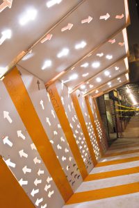
As it turned out, this heightened sensitivity to all things orange also happened to enhance the impact of our first Re:Con projects. Our prototype sidewalk shed by GRO Architects, titled Best Pedestrian Route, was both functional and aesthetic, and fully exploited the use of orange and white throughout its design. The backlit swirling arrows made playful reference to the often chaotic street-level result of redirecting pedestrians, while its oversized diagonal striping helped to lighten the mood created by construction fatigue.
Around the corner, orange and white striping had been applied with a similarly mischievous twist. Seventeen normally stodgy concrete barriers had been transformed into lighthearted ambassadors of traffic safety, proudly sporting a zebra print interpretation of the Department of Transportation’s regulation striping. Concrete Jungle remains visible to the keen observer walking along Broadway, thanks to the careful planning of artist Tattfoo Tan.
Up the block, three artists—Carolina Cisneros, Mateo Pinto, and Carlos Gomez de Llarena, worked their magic on the wire fencing surrounding the street reconstruction project on Fulton Street. Mesh overlays of varying colors, and of course with an abundance of eye-popping oranges, were carefully mapped out, and Fulton Fence covered nearly a full block of fencing.
These first three projects put Re:Con on the map, capitalizing on what was fast becoming the norm—orange everywhere, with strong incentive to pay closer attention to your surroundings. The resulting scrutiny served as its own sort of happy distraction—the projects were a big hit, and the impact of each one managed to drown out a bit of the grumbling about construction-related inconvenience. After all, it’s the construction itself that inspired these scenic oases of artwork amidst the muddle. What better reason to cross the street than to get a better view?
Tags: Carlos Gomez de Llarena, Caroline Cisneros, GRO Architects, Mateo Pinto, RECon, Tattfoo Tan

